UX/UI, Product Design
Hameh
Hameh
Let the feast begin!
Let the feast begin!
Goal
Increase the restaurant’s revenue and expand its customer base
Increase the restaurant’s revenue and expand its customer base
Duration
4 weeks
4 weeks
Design
UX/UI Design
UX/UI
Research
Research
Product Design
Product
How it started
Background
The challenge emerged when the restaurant Hameh identified a significant loss of potential customers who preferred dining at home. Recognizing a gap in their service offering, the restaurant sought a solution to make their food accessible through delivery, aiming to meet evolving customer expectations and recapture missed revenue opportunities
The challenge emerged when the restaurant Hameh identified a significant loss of potential customers who preferred dining at home. Recognizing a gap in their service offering, the restaurant sought a solution to make their food accessible through delivery, aiming to meet evolving customer expectations and recapture missed revenue opportunities
This gap not only limited the restaurant’s reach to a broader audience but also placed it at a competitive disadvantage in a market increasingly driven by convenience and digital accessibility.
This gap not only limited the restaurant’s reach to a broader audience but also placed it at a competitive disadvantage in a market increasingly driven by convenience and digital accessibility.
Problem
The restaurant couldn’t reach customers who preferred food delivery over dining in
The restaurant couldn’t reach customers who preferred food delivery over dining in
This approach allows the restaurant to expand its service model, improve customer convenience, and tap into a broader market segment without relying on third-party platforms
Solution
Develop a mobile application that enables customers to order food for delivery directly from the restaurant.
What are our steps?
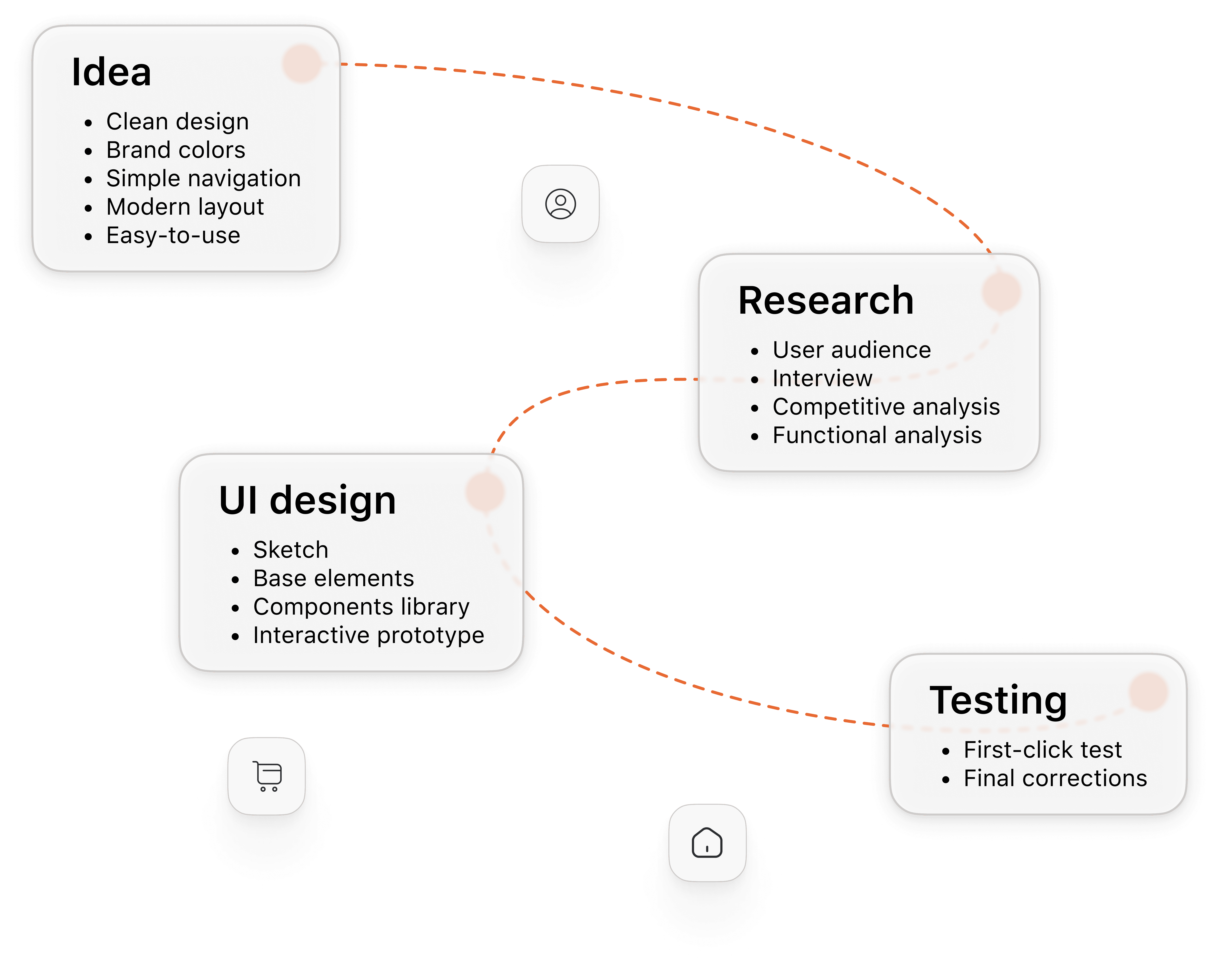
Process
The process began with defining a clear concept focused on simplicity, usability, and brand alignment. Research followed, including audience analysis, interviews, and competitive review, ensuring the solution met real user needs. Based on these insights, the UI was developed through sketches, components, and an interactive prototype. Final testing validated usability and guided last adjustments
The process began with defining a clear concept focused on simplicity, usability, and brand alignment. Research followed, including audience analysis, interviews, and competitive review, ensuring the solution met real user needs. Based on these insights, the UI was developed through sketches, components, and an interactive prototype. Final testing validated usability and guided last adjustments
Methodologies
Market analysis
User interviews
First-click test
Market Analysis
Market analysis showed a shift toward direct ordering, driven by the desire to avoid third-party fees and build customer loyalty. Users expect fast, mobile-friendly interfaces, clear visuals, and easy customization. These trends informed a streamlined, brand-focused design with a strong user experience.
Market analysis showed a shift toward direct ordering, driven by the desire to avoid third-party fees and build customer loyalty. Users expect fast, mobile-friendly interfaces, clear visuals, and easy customization. These trends informed a streamlined, brand-focused design with a strong user experience.
User Interviews
User interviews revealed key expectations and pain points around the food ordering experience. Participants emphasized the need for a simple and fast ordering flow. Many expressed frustration with third-party delivery apps, citing high fees and poor communication, and showed a preference for ordering directly from a trusted source. Based on these insights, the design prioritized clarity, ease of use, mobile optimization, and a seamless, brand-consistent experience that builds user trust and streamlines the ordering process.
User interviews revealed key expectations and pain points around the food ordering experience. Participants emphasized the need for a simple and fast ordering flow. Many expressed frustration with third-party delivery apps, citing high fees and poor communication, and showed a preference for ordering directly from a trusted source. Based on these insights, the design prioritized clarity, ease of use, mobile optimization, and a seamless, brand-consistent experience that builds user trust and streamlines the ordering process.
Insights
Preference for Simplicity
Users may express a need for a fast, straightforward ordering experience without unnecessary steps
Importance of Visuals
Clear images of food, along with descriptions and pricing, could be highlighted as essential for making confident choices
Delivery Transparency
Interviewees may emphasize the importance of tracking delivery time and receiving status updates
Mobile-First Behavior
Many users may indicate they prefer using mobile devices for ordering, prioritizing responsive and touch-friendly design
Trust in the Brand
Users may feel more confident ordering directly from a familiar, branded platform rather than a third-party service
Who are we designing for?
Personas
Personas were created based on insights from user interviews and market research, capturing key behaviours, needs, and motivations of typical customers. They represented two types of users who pursue different purposes when ordering food online. These personas guided design decisions by highlighting user expectations — such as quick navigation, visual clarity, and mobile-first interaction — ensuring the final product stayed aligned with real user priorities throughout the process.
Personas were created based on insights from user interviews and market research, capturing key behaviours, needs, and motivations of typical customers. They represented two types of users who pursue different purposes when ordering food online. These personas guided design decisions by highlighting user expectations — such as quick navigation, visual clarity, and mobile-first interaction — ensuring the final product stayed aligned with real user priorities throughout the process.

Gagik
Busy professional
41, single
IT Manager at a startup
Prefers local food, not adventurous, values speed over variety
Gagik works long hours and often has back-to-back meetings, leaving him little time to dine out or cook. He used to rely on third-party delivery apps but found their interfaces frustrating and time-consuming. He's loyal to local cuisine and wants fast, predictable service with minimal effort.
Gagik works long hours and often has back-to-back meetings, leaving him little time to dine out or cook. He used to rely on third-party delivery apps but found their interfaces frustrating and time-consuming. He's loyal to local cuisine and wants fast, predictable service with minimal effort.
Goals and needs
Get meals delivered on time
Order quickly without unnecessary steps
Find familiar dishes without searching too much
Trust the app’s reliability and design
Get meals delivered on time
Order quickly without unnecessary steps
Find familiar dishes without searching too much
Trust the app’s reliability and design
Pain Points
Long delivery times
Poor app interfaces and cluttered layouts
Repeatedly entering delivery info
Lack of clear status updates during delivery
Long delivery times
Poor app interfaces and cluttered layouts
Repeatedly entering delivery info
Lack of clear status updates during delivery
Anna
Social explorer
29, married
Marketing Specialist
Adventurous eater, enjoys discovering new food experiences
Anna enjoys exploring new restaurants and cuisines, often using food delivery apps to try dishes she’s seen online or heard about from friends. She frequently orders for casual evenings with her partner or guests, and sometimes just browses menus for inspiration. She’s drawn to good visuals, helpful reviews, and curated selections.
Anna enjoys exploring new restaurants and cuisines, often using food delivery apps to try dishes she’s seen online or heard about from friends. She frequently orders for casual evenings with her partner or guests, and sometimes just browses menus for inspiration. She’s drawn to good visuals, helpful reviews, and curated selections.

Goals and needs
See appealing visuals and real customer feedback
Discover new or trending dishes easily
Schedule orders ahead for social events
Share menus or recommendations with others
See appealing visuals and real customer feedback
Discover new or trending dishes easily
Schedule orders ahead for social events
Share menus or recommendations with others
Pain Points
No personalized suggestions or trending items
Generic or outdated-looking apps
Lack of trust in food quality from new places
No way to schedule orders in advance
No personalized suggestions or trending items
Generic or outdated-looking apps
Lack of trust in food quality from new places
No way to schedule orders in advance
Is the design clear enough?
First-Click Test
First-Click Test
Personas were created based on insights from user interviews and market research, capturing key behaviours, needs, and motivations of typical customers. They represented two types of users who pursue different purposes when ordering food online. These personas guided design decisions by highlighting user expectations — such as quick navigation, visual clarity, and mobile-first interaction — ensuring the final product stayed aligned with real user priorities throughout the process.
Personas were created based on insights from user interviews and market research, capturing key behaviours, needs, and motivations of typical customers. They represented two types of users who pursue different purposes when ordering food online. These personas guided design decisions by highlighting user expectations — such as quick navigation, visual clarity, and mobile-first interaction — ensuring the final product stayed aligned with real user priorities throughout the process.
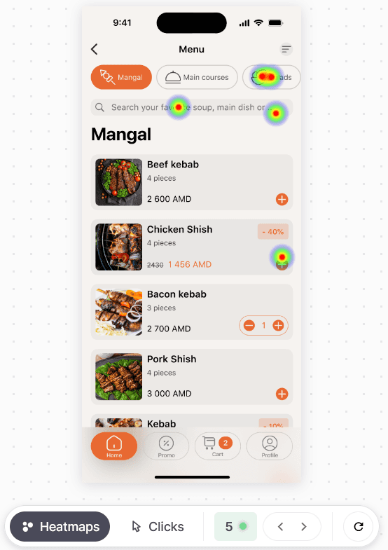
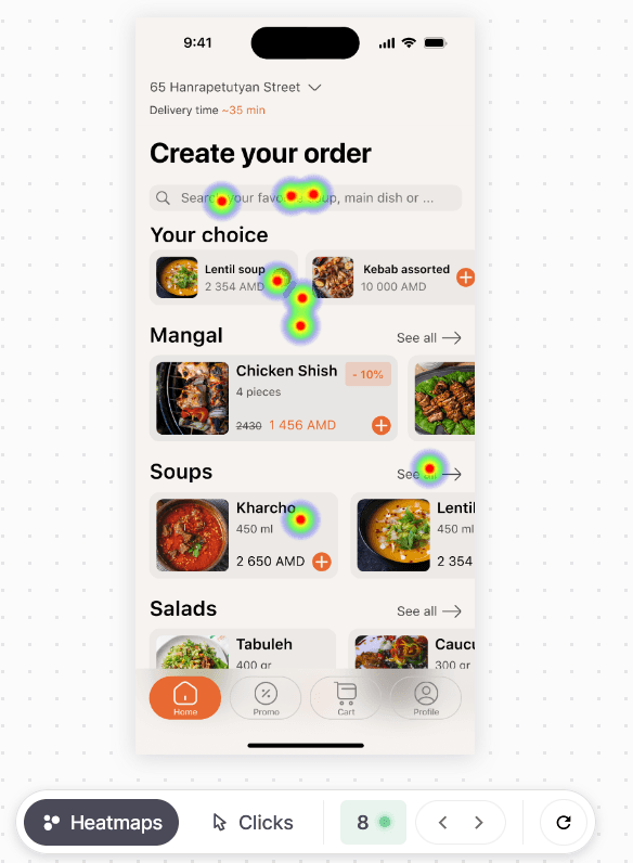
The first-click test assessed how users instinctively searched for specific dishes in the app. Participants were asked where they would tap to find “spas soup” and “lobutz salad,” with only one click allowed per task. The aim was to see whether users preferred using the general search or navigating through categories like “Soups” or “Salads.” The hypothesis expected a split on the first-level screen and a stronger preference for search on the second-level. Results helped evaluate the clarity of navigation and inform improvements to the app’s structure.
The first-click test assessed how users instinctively searched for specific dishes in the app. Participants were asked where they would tap to find “spas soup” and “lobutz salad,” with only one click allowed per task. The aim was to see whether users preferred using the general search or navigating through categories like “Soups” or “Salads.” The hypothesis expected a split on the first-level screen and a stronger preference for search on the second-level. Results helped evaluate the clarity of navigation and inform improvements to the app’s structure.
Goal
Determine user behaviour when interacting with the application
Determine user behaviour when interacting with the application
Results
UI
UI
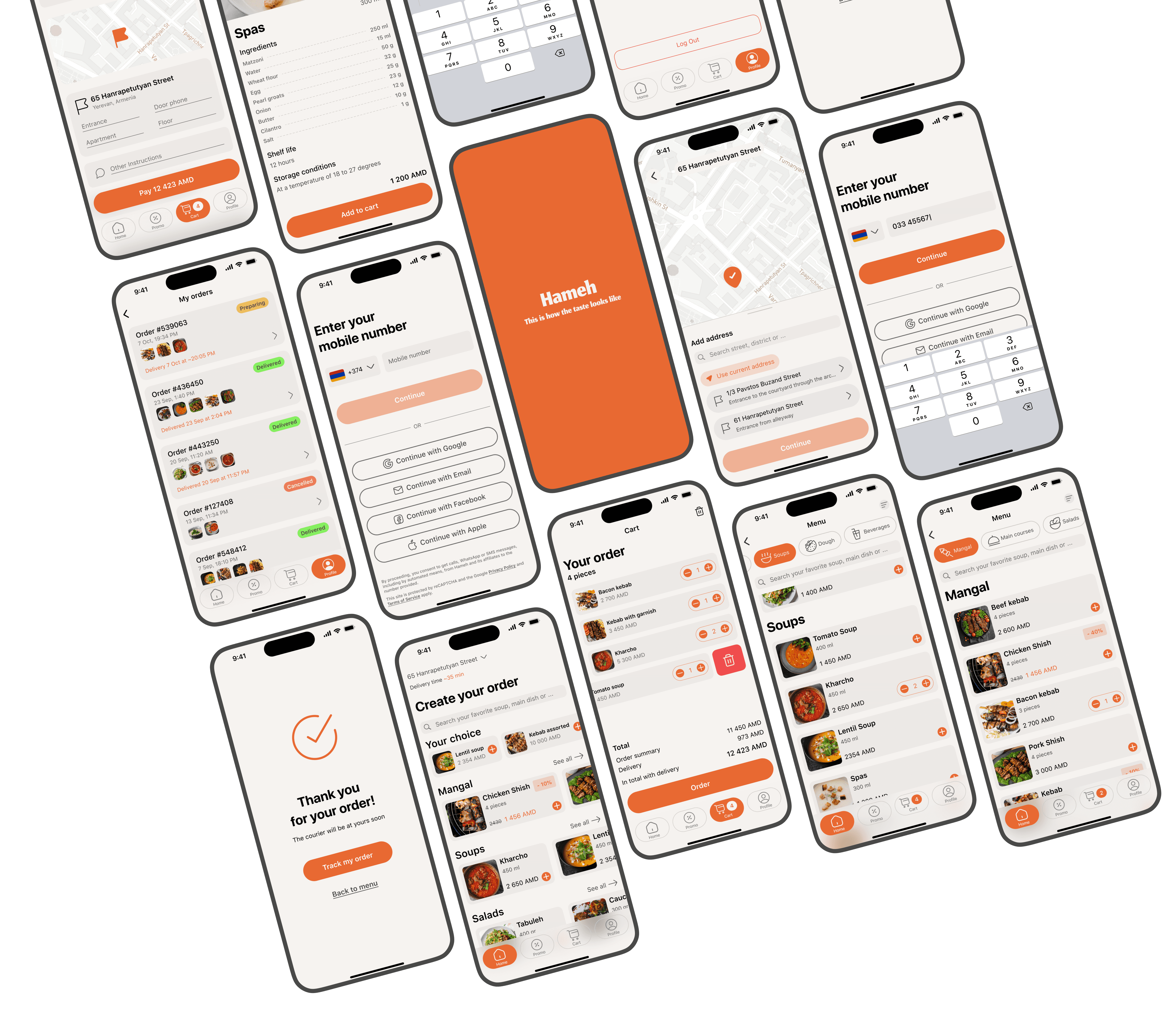
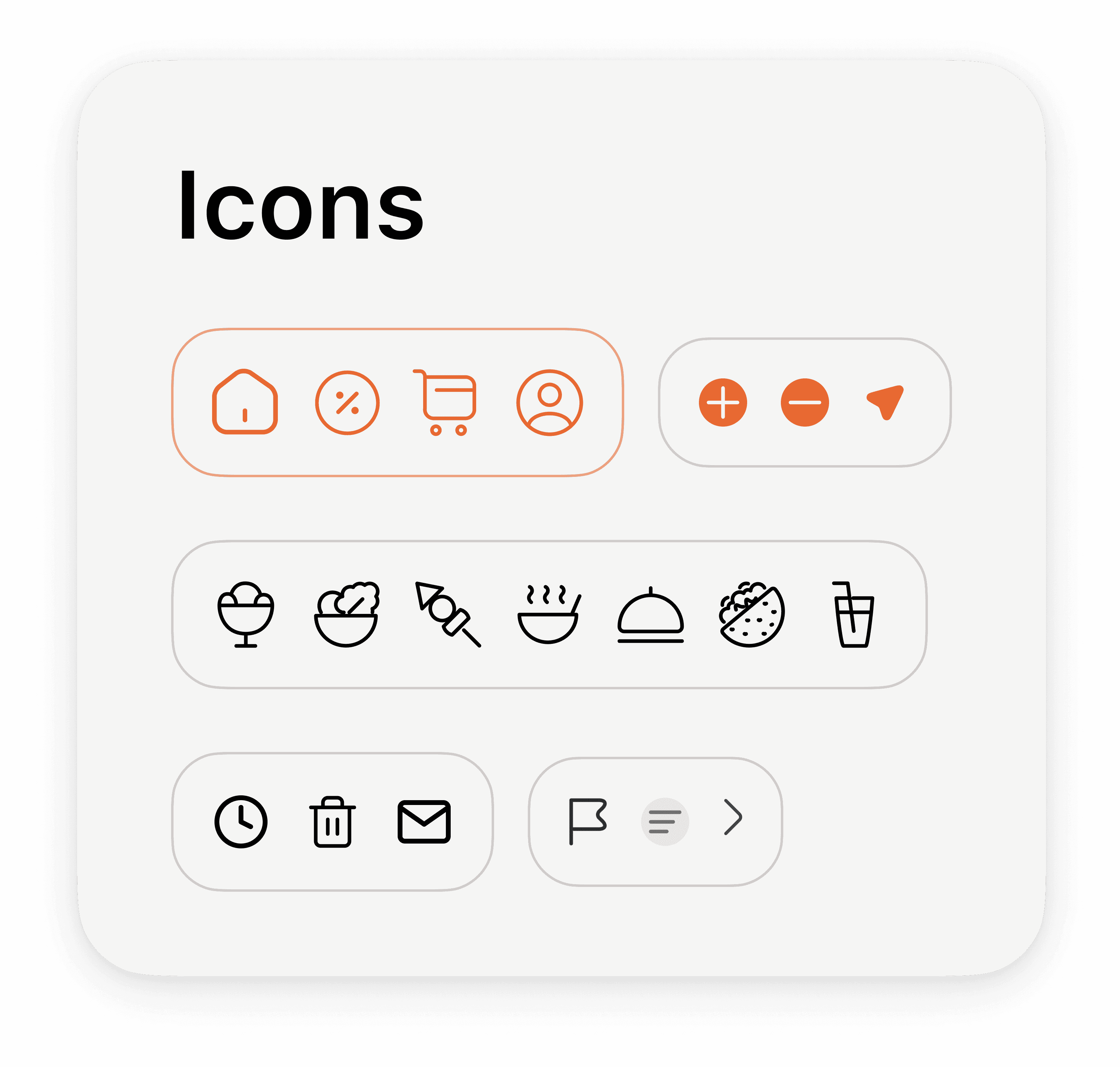
The UI was built on principles of clarity, consistency, and ease of use, with a strong focus on visual hierarchy and intuitive navigation. Key elements such as a clean layout, branded color scheme, and recognizable icons were designed to support quick decision-making and reduce cognitive load. Accessibility and mobile responsiveness were also considered from the start. To validate design choices, interactive prototypes were tested through first-click testing, allowing early feedback on user behavior and navigation patterns. Insights from testing informed refinements to layout, search placement, and category visibility, ensuring the interface met user expectations and supported a seamless ordering experience.
The UI was built on principles of clarity, consistency, and ease of use, with a strong focus on visual hierarchy and intuitive navigation. Key elements such as a clean layout, branded color scheme, and recognizable icons were designed to support quick decision-making and reduce cognitive load. Accessibility and mobile responsiveness were also considered from the start. To validate design choices, interactive prototypes were tested through first-click testing, allowing early feedback on user behavior and navigation patterns. Insights from testing informed refinements to layout, search placement, and category visibility, ensuring the interface met user expectations and supported a seamless ordering experience.

All that separates you from your favorite food is a start screen and phone number registration.
All that separates you from your favorite food is a start screen and phone number registration.

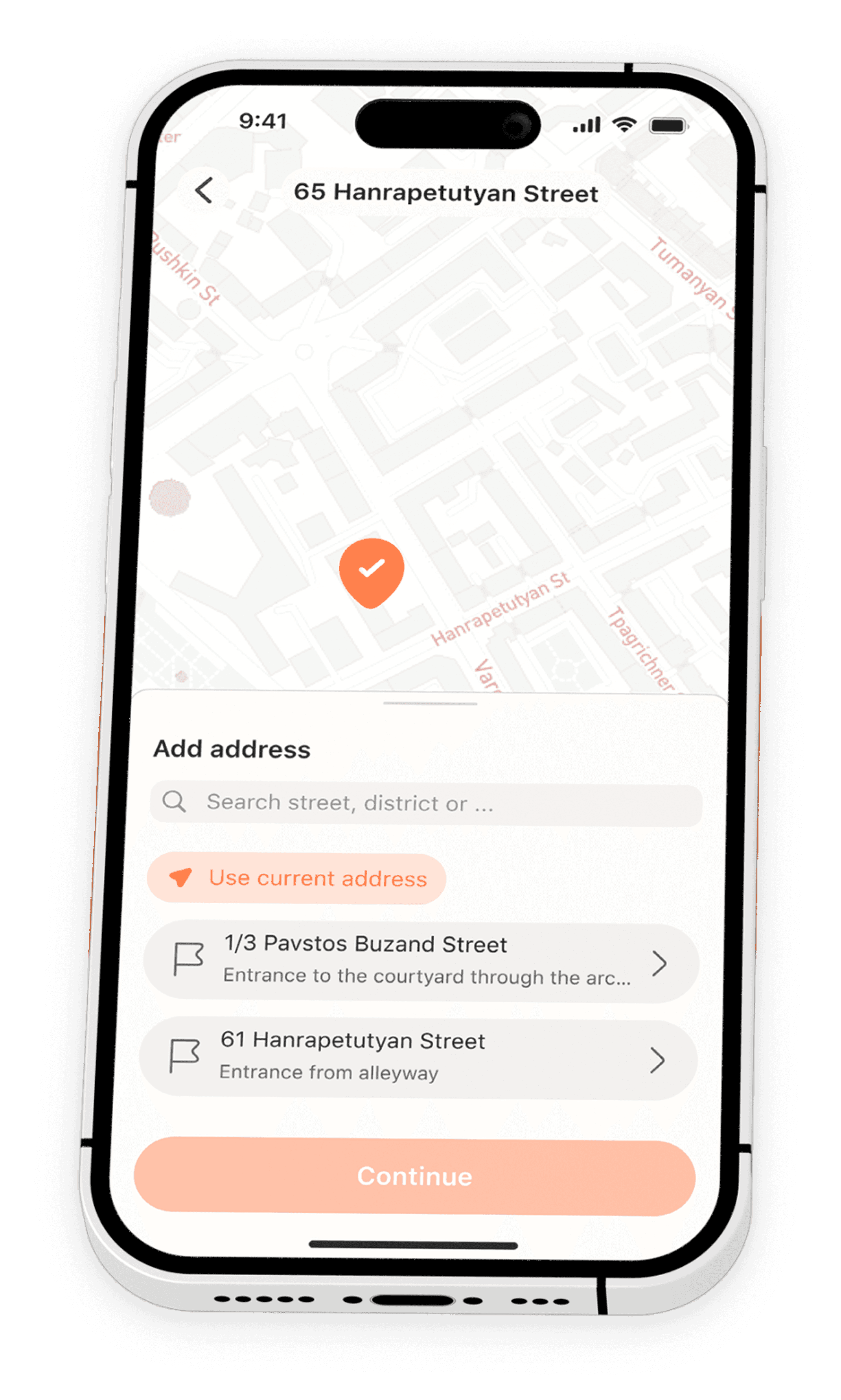
Start Screen
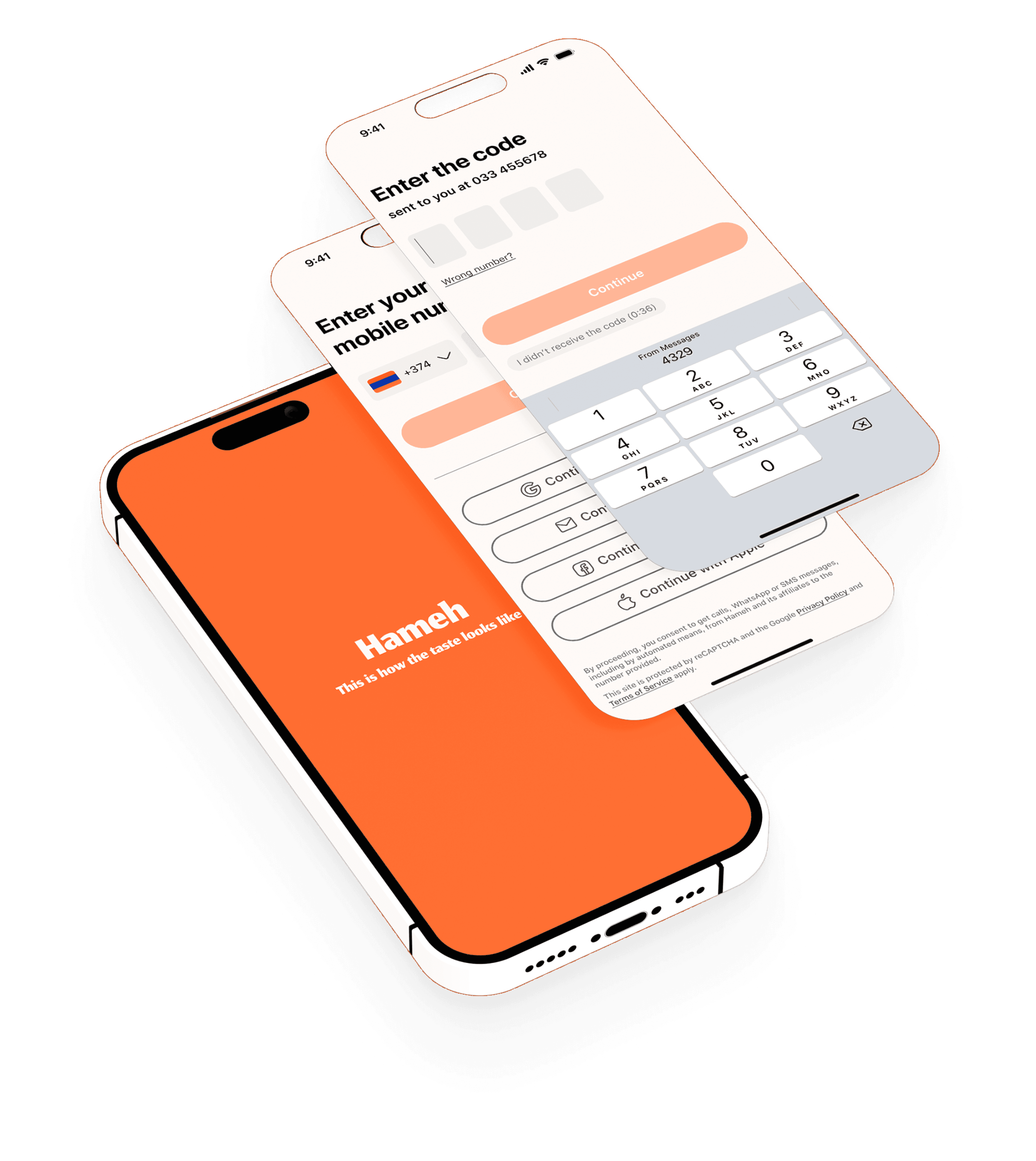
Screens
Screens
All that separates you from your favorite food is a start screen and phone number registration.
All that separates you from your favorite food is a start screen and phone number registration.
Address Selection
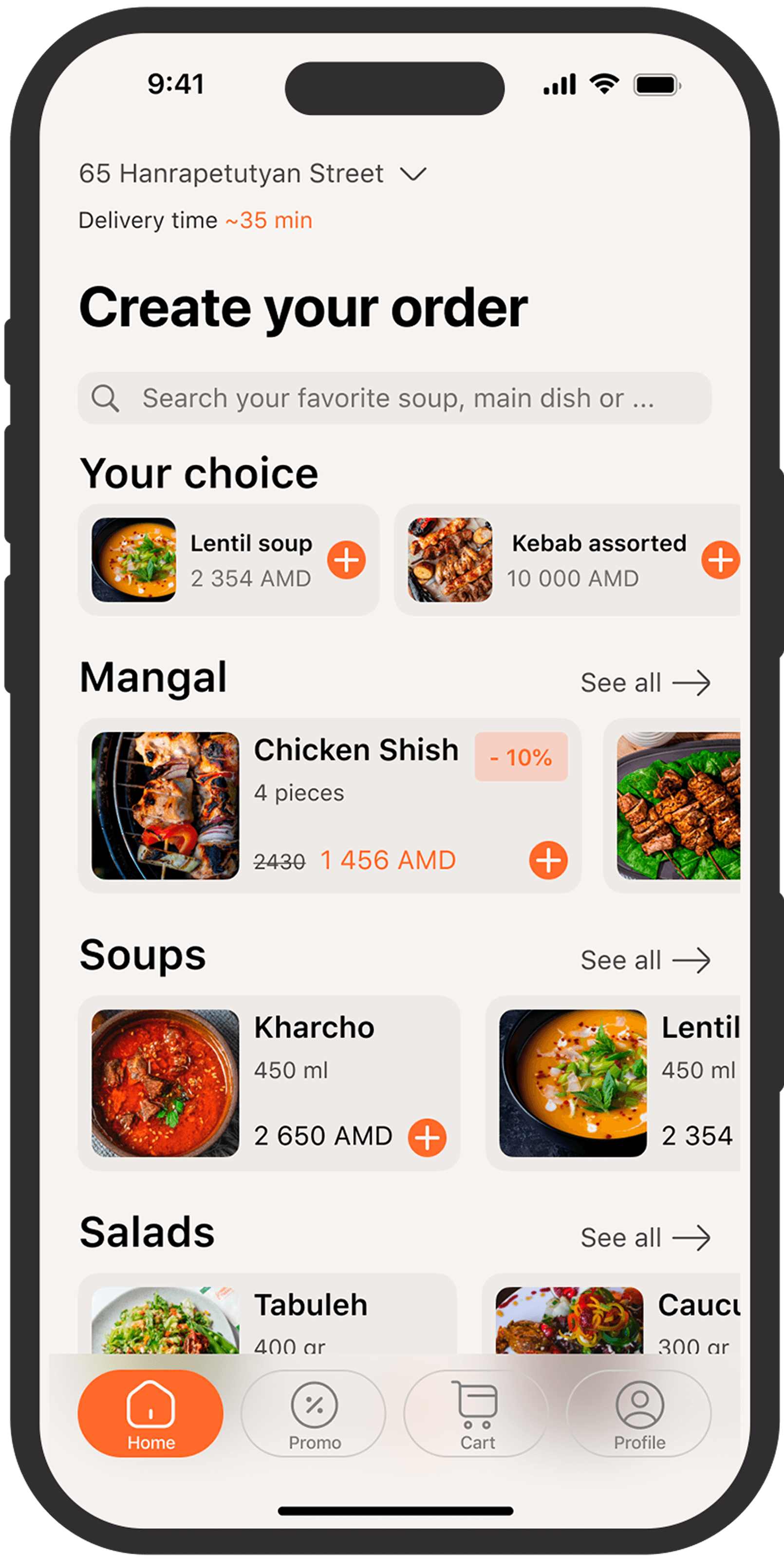
The heart of the app. Here you can add the most delicious food to your cart.

Home


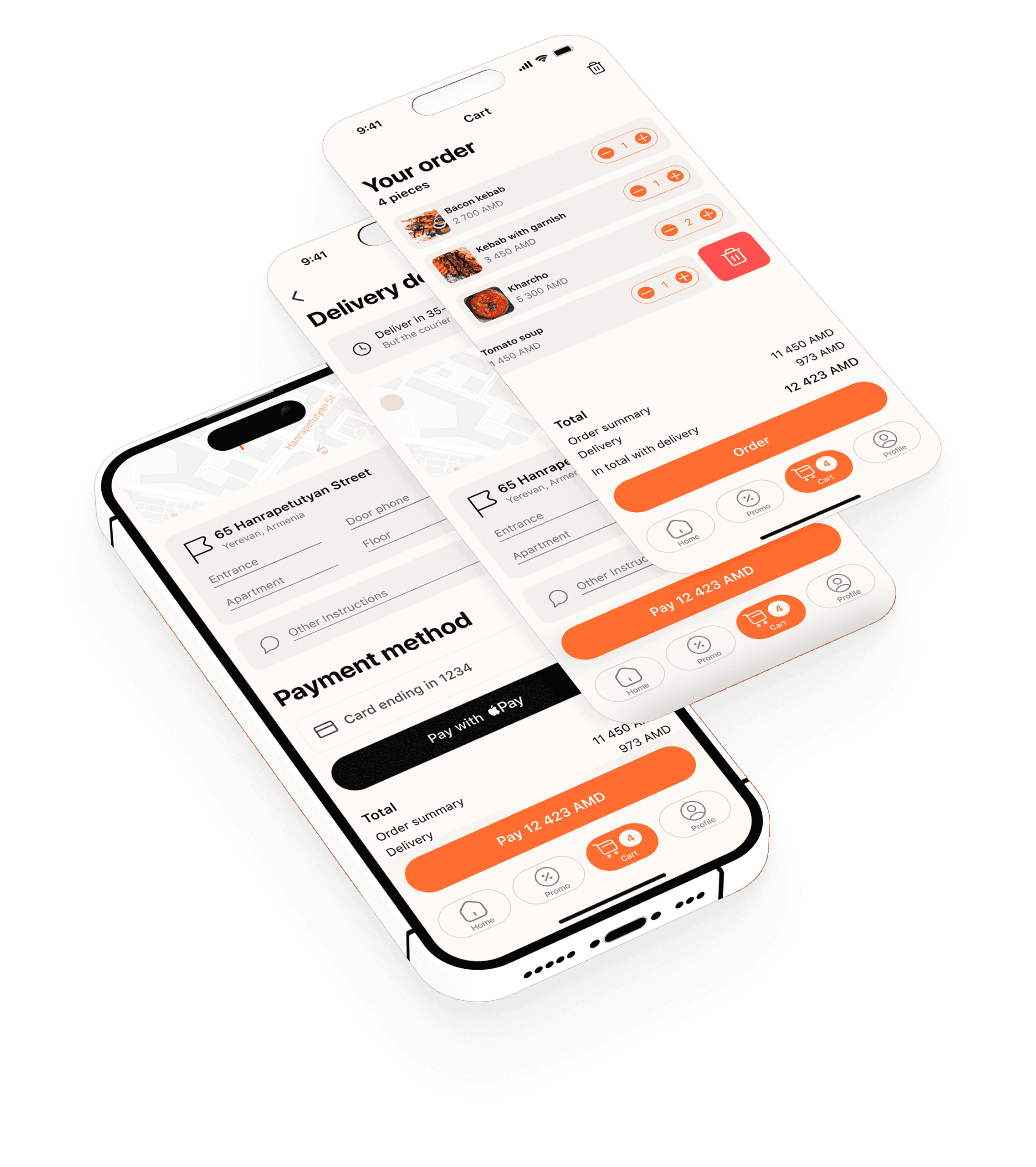
Once you have filled your cart, choose a convenient payment method and confirm your order.
Cart and Delivery
The heart of the app. Here you can add the most delicious food to your cart.

Profile